Another gist that'll do simple GIS things for you in relatively simple python:
gist.github.com/tewhalen/wktplotpoly.py
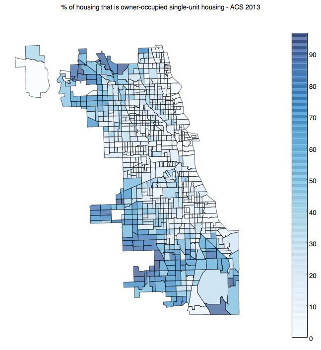
This will let you plot shapefiles that contain POLYGONs and MULTIPOLYGONs (say, boundary files you get from the City of Chicago Data Portal) using matplotlib, and do some fun graphic things like:
With code that's as simple as:
:::python
from wktplotpoly import getPolygons

import matplotlib.cm as cm
import numpy.random as npr

# this setup code is probably necessary for reasonable use
fig = plt.figure(facecolor="white")
ax= plt.axes()

# pick random values for each CA
values = npr.rand(700)

# 1. install GDAL
# 2. download a shapefile
# 3. convert shapefile to CSV+WKT
#    ogr2ogr -f CSV output.csv input.shp -lco GEOMETRY=AS_WKT


coll = getPolygons("output.csv", key='TRACTCE10')

# color the polys using the random values
coll.set_cmap(cm.Reds)
coll.set_array(np.array(values))
coll.set_alpha(0.6) # for pretty

ax.add_collection(coll)
plt.axis('equal')
plt.axis('off')
plt.show()