Continuing my quixotic tilt against policies which treat the "hot" areas in Chicago as if they're great examples of complete neighborhoods, I made more charts.
Earlier, I looked citywide at which neighborhoods are most atypical in terms of having a huge mass of young adults. Let's drill down a bit on a few of them.
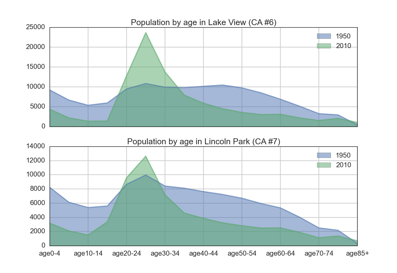
Here's Lake View and Lincoln Park. You probably don't need me to point out that what was once a gently-rolling landscape of ages is now a desert with a single mountain.
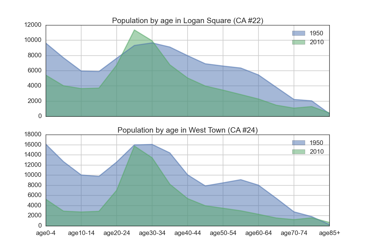
And here's Logan Square and West Town. Again, we see a similar pattern of change. These neighborhoods are more and more places where only young, childless adults want to live. Yes, they're "vibrant", yes, they're "desirable", but it is a limited sort of vibrancy, and a very narrow slice of the population that finds them desirable. And, look more closely at Logan Square: it's still "gentrifying", but is that gentrification really understood best as a change in the wealth of the population, or a transformation of the neighborhood age mix?
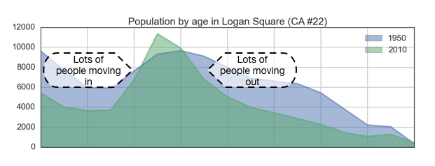
Note also that what makes these big peaks possible is a lot of transience. Transience relies on many factors outside of the neighborhood - places for people to come from, places for them to go, reasons for them to leave where they were, etc. If these factors change, what happens?