Category: flag

Wallace Rice on Chicago Stars

From a 1928 letter by Wallace Rice to a Mr. Ettleson:

To return to the six-pointed stars in the Chicago municipal flag. By the terms of the competition under the rules laid down by the Chicago Flag Commission in 1917, the use of religious symbols, which included the cross, the star and crescent, and the two triangles, one reversed and superimposed, was barred, for obvious reasons. [1] The five-pointed star, symbol of a soverign State, was also considered out of place, for reasons which I hope have been made equally obvious here. Chicago is a city.

After more than four hundred designs had been made by me, I finally struck upon such a six-pointed star as had never appeared in any flag before, peculiarly and singularly a Chicago star, made by a Chicagoan for his greatly loved city, by an American in the tenth generation in this country, whose ancestors had fought against Great Britain, for the most American of American cities. It differs from all other stars in use in European heraldry and in State and National flags and coats-of-arms, and is specifically for and of Chicago and nowhere else on earth because its points are straight and not like the usual heraldric etioile curved like flames, and because these points subtend an angle of only thirty degrees, instead of the sixty degrees subtended in the star made by superimposing a triangle.

  1. According my copy of the rules, on file at the Chicago Public Library’s municipal reference collection, no rule specifically bars religious imagery.

Suggestion #7

Suggestions Submitted for the Guidance and Information of Contestants in the Public Competitive Contest for a Suitable Design of a Municipal Flag for the City of Chicago — Wallace Rice, 1916.

Suggestion 7.

The visibility at distances of the several colors and of the different portions of the flag itself should be taken into account in determining its proportions, rather than divisions of mathematical exactitude. In other words, it is the effect of symmetry, not the mere physical fact, which should be taken into account. The French, for example, after extensive experimentation, divide their tricolor so that the blue next the staff has thirty parts in a hundred, the white in the middle thirty-three parts, and the red in the fly thirty-seven, and thus secure the appearance of an equal division.

I suppose this explains why all the descriptions of the flag have tortured syntax — the “slightly less than a sixth” language. Rice wanted the white and blue stripes to appear to have the same width, and so they must be slightly different.

Offer Design For City Flag; What It Means

[from the Chicago Daily Tribune, March 29th, 1917, p.13]

OFFER DESIGN FOR CITY FLAG; WHAT IT MEANS

Design for a Chicago Flag, to be emblematic of a robust municipal ideal, was submitted to the city council yesterday by the Chicago municipal flag commission, appointed by Mayor Thompson eighteen months ago. The commission describes the flag thus:

“Its uppermost stripe, of white, is eight inches broad; the second stripe, of blue, is nine inches; the central bar, of white, is eighteen inches, and the two lower stripes correspond with the uppermost two. Near the staff on the broad white stripe are two six pointed red stars, fourteen inches tall.”

“Viewed locally, the two blue stripes symbolize the Chicago river with its two branches and the three white bars represent the three sides of the city. The red stars stand for the Chicago fire and the World’s fair, two great influences on the city’s history. The six points in the first star stand for transportation, trade, finance, industry, populousness, and healthfulness; those in the second for religion, education, aesthetics, beneficence, justice and civism [sic].”

“Considered nationally, the blue stripes stand for the mountain ranges which flank the plain of which Chicago is the center. The central white bar stands for this plain and the two outer white bars for the Atlantic and Pacific coasts.”

The flag was designed by Wallace Rice, 2701 Best avenue.

upcoming information

This is just a little teaser for series of upcoming posts, where some surprising facts will be revealed:

  • Proposed fifth stars for the Chicago Flag, including one that Richard J. Daley planned to “explore”.
  • The original two stars on the flag might not represent what you thought!
  • How sharp should the points on the stars be? Perhaps even sharper than you imagine!
  • Alternative symbolism of the white and blue fields!

Stay tuned!

continuing obsessive coverage of chicago stars

The journal of the Great Waters Association of Vexillology (the study of flags is called Vexillology) reports on the original proceedings of the 1917 Chicago City Council that adopted the flag design, which at that time, only had two stars. Here’s an image of the original flag as pictured in the Chicago Herald and Examiner in 1921, courtesy of the Chicago Historical Society. I’ll quote the relevant portion of Wallace Rice’s description here:

Next (to) the hoist and two inches from it at the nearest point is a red star fourteen inches tall with six points drawn from a circle six inches in diameter. Two inches from this is a second star of the same size. […] The two stars stand for the two great formative events in Chicago history, the Great Fire of 1871 and the World’s Columbian Exposition of 1893. They are given six points each that they may not be confused with the five-pointed stars which stand for the States of the Union in the American Flag.

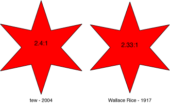
The bold passage (emphasis mine, obviously) gives us numbers, slightly different from the numbers I calculated in my previous post, “what is the deal with the stars on the chicago flag?”. There, I got:

The outer radius (the circumradius) is 2.4 times the length of the inner radius (which, in Adobe parlance, is the circle which intersects the points of concavity, not the incircle of the hexagon).

The 1917 numbers give an outer radius 2.33 times the inner radius. Let’s compare these stars:

These stars are very, very similar, but more importantly, they’re both pointy. I was going to post a very long entry with all the trigonmetry necessary to show the exact percentage difference in area, but I think I’ll spare you, this time. The key here is that the star was designed to be sharp from the very start, and distinct from the regular hexagram.

Which of the two is most correct? It’s hard to say. I’m pretty sure that Rice’s 1917 14:6 number is just rounding error. He probably just didn’t want to write 14.4 inches. Since the difference is so very small, let’s call them both within the margin of error.

However, the stars on the very same page in the GWAV’s journal are wrong wrong wrong. Those are clearly regular hexagrams in the illustration, 1.73:1 six-pointed stars. I’m going to have to send them a letter.

Staypressed theme by Themocracy