Category: thinking

what i saw in new york city

I was in New York City for the first time over Halloweeen. It was pretty okay. I would describe it as just like Chicago, only on an island and with a 200 year headstart. The downside of having such a large population is that even though the assholes-per-capita number (0.053) is probably the same as other places, you’re running into them more often simply because there are more of them.

The best thing I saw in NYC was the public library, specifically, the Newton exhibit. If you’re at all the kind of person who would totally spazz out upon seeing, for instance, a first edition of the Principia interleaved with Newton’s handwritten notes for the second edition, you should certainly go.

And, if like me, you found the scene in Quicksilver where Newton stuck a knitting needle in his own eye unbelievable, you will be thrilled to see the actual notebook he was taking notes in while he was doing it, along with a hand-drawn diagram of where he was putting that needle.

It’s on until February 5th.


with all deliberate haste

There are some interesting insights in this essay by Paul Graham, on why American things (cities, buildings, cars) can be so ugly.

We don’t especially prize design or craftsmanship here. What we like is speed, and we’re willing to do something in an ugly way to get it done fast.

He does get a little self-contradictory in parts, though. Americans lack taste, and therefore tend to build things quickly and superficially, but Americans have taste, so they’re increasingly choosing things like iPods and imported cars.

Still, some things to think about.

drop everything and read this

…then don’t pick anything back up.

The Guardian publishes a great essay on the virtue of idleness. So, so great. My favorite extract:

When the sickly velvet-coated dandy Robert Louis Stevenson fell ill in 1873, aged 23, the diagnosis was “nervous exhaustion with a threatening of phthisis” and the prescription was a winter on the Riviera, “in complete freedom from anxiety or worry”. Once upon a time, we knew how to be ill. Now we have lost the art.

(via Crooked Timber)

what is the deal with the stars on the chicago flag?

The flag of the city of Chicago is rich in history and symbolism. In fact, the municipal code specifies, in some detail, the design and meaning of each of the flag’s elements. However, the code also leaves much to interpretation, especially the shape and placement of the stars.

There shall be four bright red stars with sharp points, six in number, set side by side, close together, next to the staff in the middle third of the surface of the flag.

So we’ve got four stars with six sharp points, close together. Here are a few interpretations of this instruction from around the web.

a slightly pointy star of david somewhat pointer, but still looking pretty regular probably the same star as above just a plain old hexagram

The first is from a patch the Chicago Fire sell. Next we have the stars from the Chicago Public Library information on the flag page. Then the stars from Wikipedia’s Chicago Flag entry. Finally, the stars from an eBay auction of an “authentic” Chicago Police flag patch.

All of the above representations are very nearly perfect hexagrams . The star polygon {6/2} is made from six points, equally spaced upon a circle, connected via straight lines. It’s also known as the “Star of David”, and you may recognize it as the preeminent symbol of Judaism. Would the points of the hexagram be characterized as “sharp?” Not compared to the pentagram, which you may recognize as the “normal” five-pointed star.

The pentagram has a “pointy” angle of 36 degrees (more about this angle later), but the hexagram is somewhat dull, with only a 60 degree point. Fortunately, most actual Chicago flags feature a, um, pointier star.

very nicely pointy perfect, in my estimation

The first is from an actual photograph of an actual flag , flying in front of a downtown church. The other is from eBay auctions of real flags.

These stars are considerably sharper or “pointier” than the regular Star of David. To my eye, they look much more “Chicago” than the more regular 6-pointed stars. How much pointier should the stars be? Well, I’ve come up with a system by which we can derive the proper shape of the Chicago flag’s star, and I’ll suggest it as the future standard by which all Chicago flag stars should be constructed.

First, consider the pentagram. We can all agree that its points are “sharp” and its proportions are pleasing. Interestingly, its points are golden triangles, well known to be pleasing to the eye. Let us construct a six-pointed star according to the same pleasing principles.

First, construct a regular hexagram:
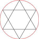
a hexagram inscribed in a circle

Using the hexagon produced inside, plan a golden triangle as the point.
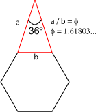
an isoceles triangle with a 36 degree point

Multiply this triangle for each face of the hexagon and fill with red.
a proper chicago star

Here we have what I think are the proper proportions for the Chicago star. It is certainly distinct from the Star of David, but is also founded upon geometrical principles and resembles in proportion (golden proportion!) the five-pointed stars we know so well.

I’ve also helpfully calculated the ratio between the inner and outer radii. The outer radius (the circumradius) is 2.4 times the length of the inner radius (which, in Adobe parlance, is the circle which intersects the points of concavity, not the incircle of the hexagon). I won’t show my work here, but let me tell you, it was a pretty good review of sophomore year trig to get this number. Now that I’ve done all the work, you can use Adobe Illustrator to create these stars effortlessly. Here’s the relevant dialog box:
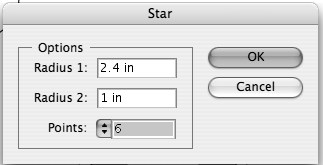
a dialog box from Adobe illustrator showing the right settings

Please feel free to call or write to your alderman about this issue. Let’s get this taken care of, Chicago!

my reading material warps my mind

I was warned by my friend Bob last night that I need to read the Economist with more salt grains. I guess Salon’s got some new article saying the Economist needs to be “debunked” again. Well, I read the article Salon refers to, and I thought it was pretty awful, but I think it knew how awful it was. It seemed almost apologetic in explaining how tenuous the data was that supported its conclusions. I got the feeling that most everyone looking into the issue of global economic inequality has really no idea how to get a decent handle on the problem. I understand the Gini coefficient — but after that it’s all a blur in my mind. Also, depending on the day of the week, I either have no idea what the consequences of income inequality are and or I am fighting mad about it.

Maybe the article was actually a cynical piece designed to make me think that a clear issue is actually cloudy. All I know is that as soon as I hear or read the word “globalization” I get tired. And when I see the words “International Monetary Fund”, I start to get cranky. Also, I am really tired of hearing about Argentina. That’s right, Argentinians, I’m sick of your whole country.

I guess the point I’m trying to make is that I really like reading the Economist, because it’s well-written and topical, but I fear that it’s turning me into either a Tory or a befuddled idiot incapable of rational thought.

Staypressed theme by Themocracy